Bespoke Kitchen Design - The Georgian Kitchen Diner Reveal
I’m back at one of my favourite homes today - the Georgian Grade II listed house in Boston Spa. I had already worked with these clients on their home office and master bedroom but today I’m sharing the final reveal of the kitchen-diner and open plan playroom. This is definitely one of the trickiest kitchens I’ve worked on from a layout perspective! A lot of thought went into creating a functional design that maximised the space while ticking all of the clients’ boxes. I’ll be sharing lots of before and afters, as well as important considerations when designing a bespoke kitchen to make sure that your space works functionally and looks great.
A Challenging Layout
The existing kitchen wasn’t working for the family of four. The island overhang was meant as a breakfast bar but was never used, with the clients preferring to sit on the windowseat instead. Storage was also an issue and there wasn’t enough worktop space around the hob area which made cooking awkward. The main requirement for the kitchen was a clutter-free space with lots of storage so that everything has its place.
The main issue though was the overall layout of the space. When the previous owners added the conservatory, they kept the large pillar in the middle of the room rather than opening it all up. They ended up with two openings leading from the kitchen space to the dining area in the conservatory which meant that a lot of room was wasted. We needed to think of a way of turning this into useable space without closing up the gap which lets lots of much needed light from the conservatory into the kitchen area.
Finally, we needed to factor the open plan playroom into the design, making it work better for the children now that they were a bit older.
Oh and another important requirement was space for the dog crate!
The Kitchen
While there are some great off-the-shelf kitchen suppliers out there, for tricky spaces like this, custom cabinetry makes things so much easier. Although we considered other options, we realised early on in the design process that the unique needs of this space really required a made-to-measure kitchen solution. Enter Ryburn Valley Furniture. I've worked with them on other client projects, as well as on my own kitchen project. They're always really helpful throughout the entire process of having a kitchen installed and because their products are bespoke, they can cater to the unique style and individual needs of each client. Their kitchens use high-quality materials that stand the test of time.
So many considerations need to be taken into account when designing a kitchen, especially if you’re going bespoke.
Focus on functionality
The kitchen is usually the most used room in the home and is definitely the most important one to get right from a functional perspective. Coming up with a kitchen layout that works well is a bit like doing a jigsaw, moving things around again and again until every element works perfectly. The most important guideline when designing a kitchen is the ‘kitchen triangle’ where the fridge, hob and sink are positioned in a triangular shape. The sink and dishwasher should also be next to each other and the bin should be located nearby, although this isn’t as much of an issue these days with most of us having a separate worktop bin for food recycling.
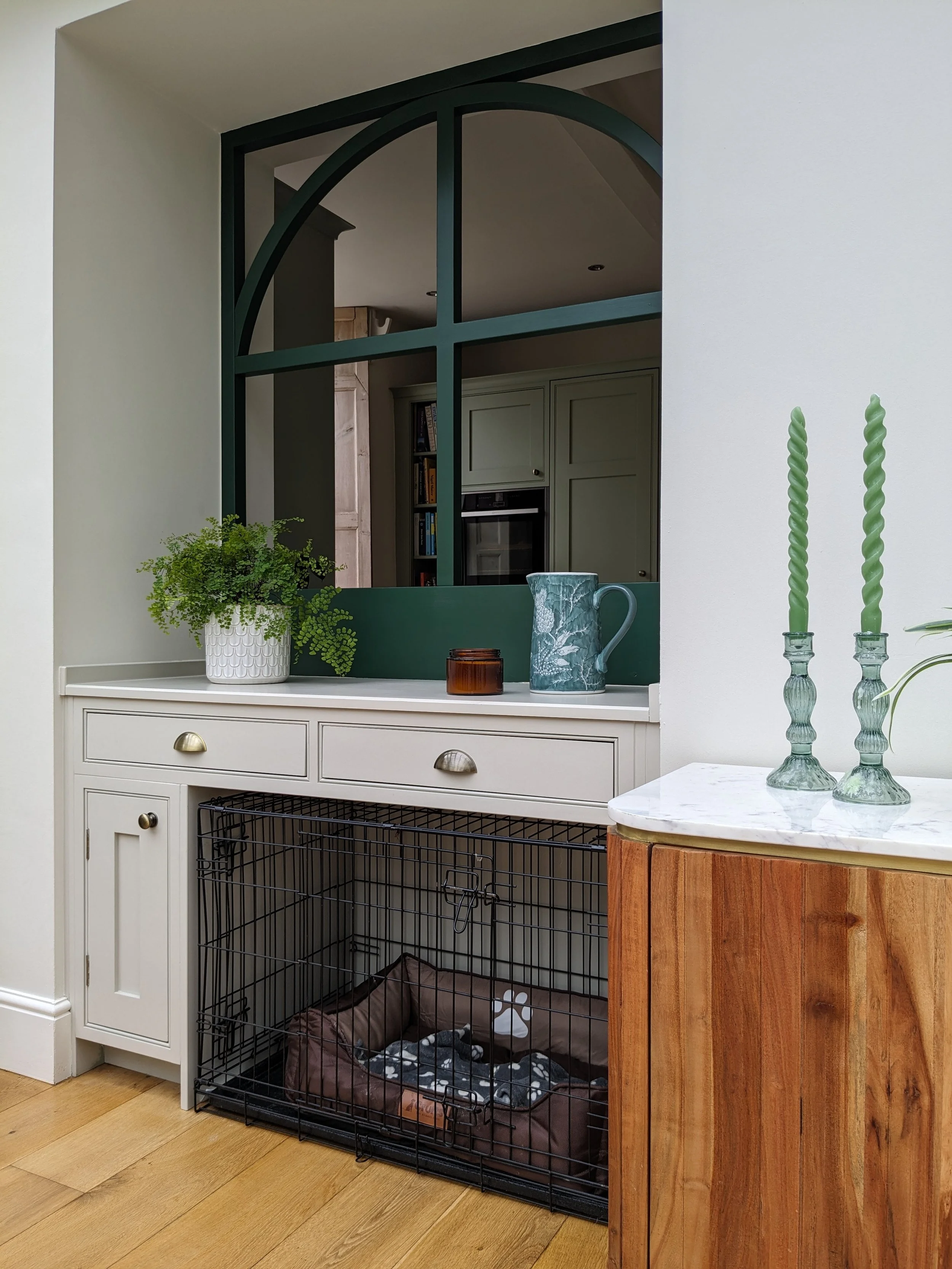
After a lot of work and 3D planning using my Sketchup software, I recommended keeping the opening on the left for access to the dining area but blocking the other opening by continuing the kitchen units running along in front of it. A ‘false window’ above would allow the natural light to flood in from the conservatory.
How lovely does it look?! They have a great view of the conservatory and garden from the cooking space! The opening also allowed us to increase the depth of the work surface behind the induction hob, creating space for a downdraft extractor which also acts as a splashback.
I chose an arched design for the frames to tie in with the Georgian architectural details found elsewhere in the house, such as in the front door fanlight and the lounge alcoves. Can’t wait to show you what’s in the dining space on the other side of this window!
A kitchen island is on most people’s kitchen wishlists but they don’t work in all spaces. Here, a peninsula works much better and provides ample space near the hob. We talked about adding an overhang on the peninsula for a breakfast bar but the clients don’t find countertop stools very comfortable. The window seat was a very contentious issue with one client wanting to keep it and the other wanting to keep the space clear. The lady of the house won the argument but we came up with a curved design for space saving and to allow the door of the larder unit on the left to fully open. The gap to the right of the window seat is a bit smaller so we incorporated open storage at the end of the tall kitchen run. Like I said, it’s like doing a jigsaw!
Clear the clutter with clever storage solutions
Opting for a bespoke kitchen also means that there’s more freedom to create clever storage solutions by customising units. From the built in chopping boards to the pull out spice cupboard and bin unit, every element was carefully considered.
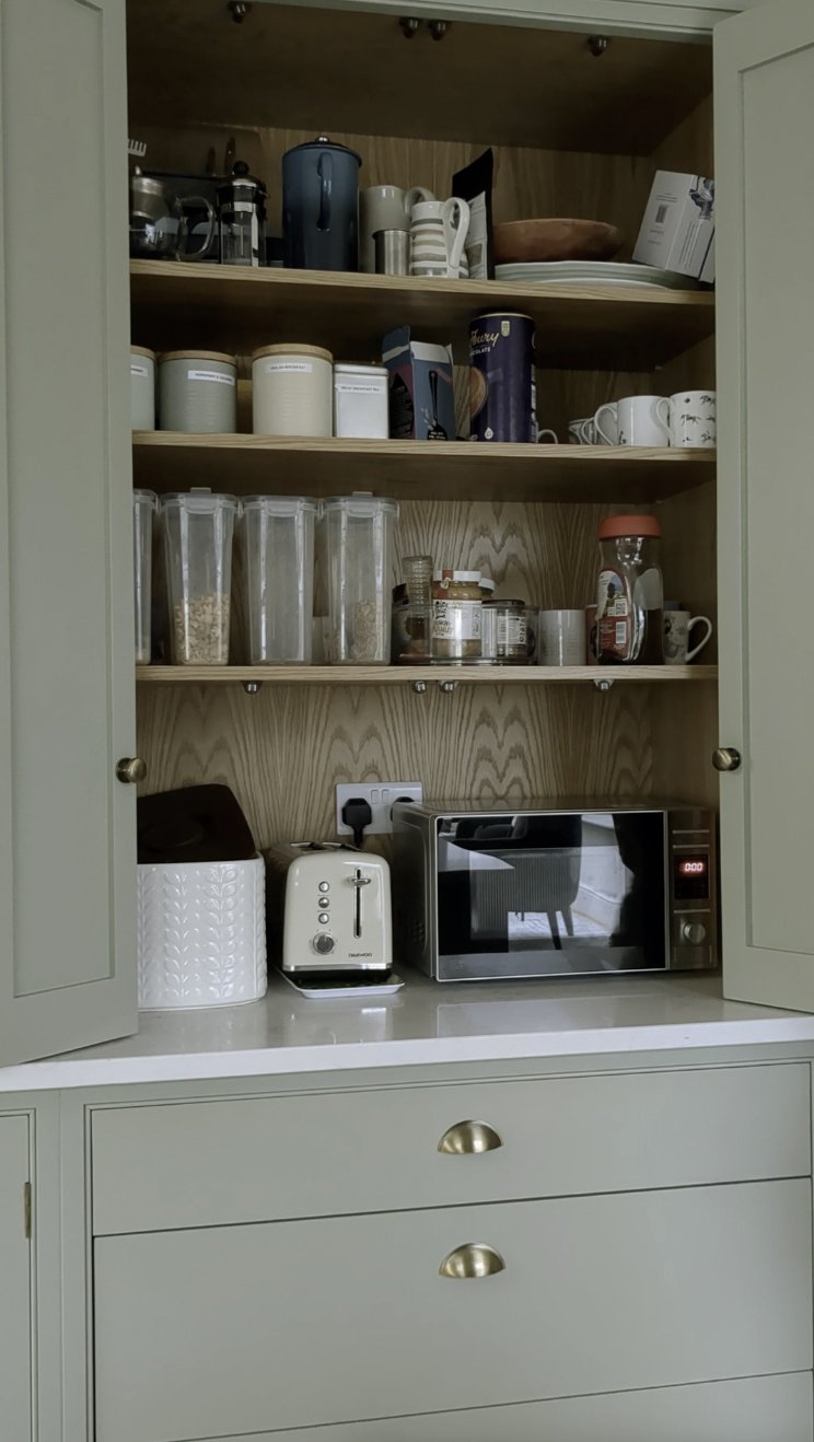
Larder units with spice racks in the doors are fantastic for maximising food storage space and we incorporated a worktop unit with concertina doors which houses the microwave and toaster.
Customise the style and colour
With a bespoke kitchen design, there are endless options when it comes to door styles. Here, we wanted a british kitchen look with a timeless kitchen design to suit the style of the house so we chose a classic shaker style for the cabinet doors, with subtle beading around the edges for extra detail.
Because this is an open plan space, it was really important that the colours in each area complemented each other. While we kept walls neutral, we used different shades of green in each zone to ensure a nice flow. The kitchen cabinetry is painted in Little Greene’s Boringdon Green. With the kitchen being east facing, it doesn’t get much natural light so we needed a warm neutral for the walls. We chose Little Greene’s Stock - a lovely creamy white - which has really lightened up the space.
Get the lighting right
Task lighting is so important in a kitchen. We kept the existing downlights in the ceiling which saved on costs and we supplemented them with additional light sources like under cabinet wall lights in the sink area and motion activated LED lights in the larder cabinet. The downdraft extractor provides task lighting for the hob area and we added the wall light above the alcove shelves for accent lighting.
The Dining Space (with bespoke dog bed!)
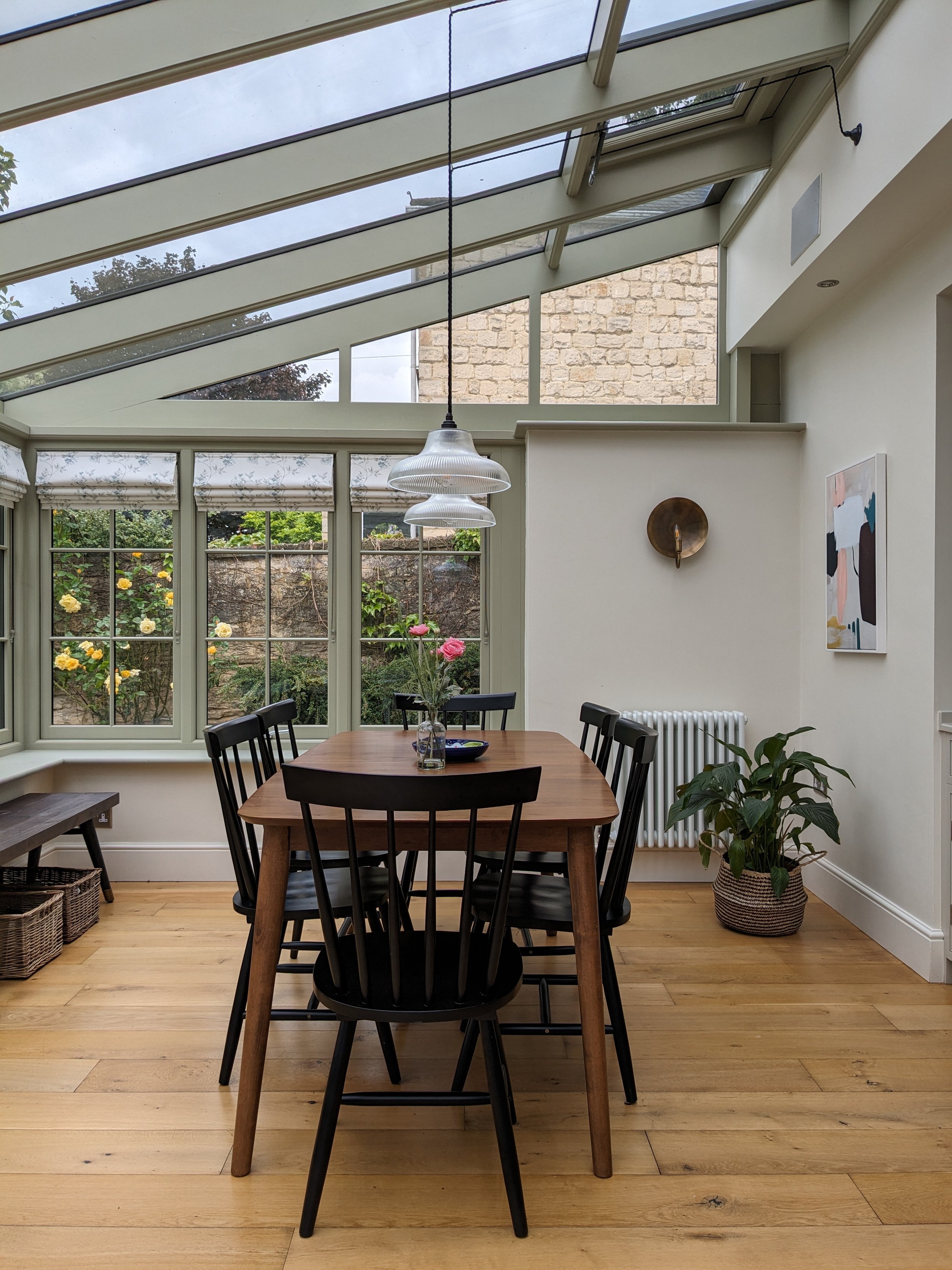
We chose an extendable dining table for flexibility - great for when the clients have family gatherings.
Previously, there were only a couple of wall lights and a few downlights in the beam at the edge of the room to light the whole conservatory. The clients often ended up eating their dinner on their knees in the lounge when they had friends round because it was too dark in here. Not ideal. We needed to find a clever way of lighting up the dining table so I recommended having two pendant lights wired in to the side of the beam and then swagged over the dining table. It’s worked really well!
And for the piece de resistance, behold my first ever bespoke designed dog bed! I designed the drawers and cupboard to fit the gap in the opening behind the hob and the crate is slotted in so it can be removed when needed. I'm so happy with this design feature!
The woodwork in here was already painted in Normandy Grey - it's perfect for the space and really complements the Boringdon Green of the kitchen cabinets so we were able to save some money by only having the chipped windowsills painted. The sideboard provides extra storage for placemats and the like. It's from Atkin & Thyme and it's such a beautiful piece of furniture with fluted wood detailing and a marble top. The comfy seating area has a lovely view of the garden (Jack the whippet loves sunbathing here).
The Play Area
The clients wanted the playroom to become a cosy space with a fun feel. We needed to incorporate space for playing, drawing, crafting, reading and TV watching. The walls here are painted in Little Greene’s Portland Stone - a great neutral shade for both north and south facing rooms - and the built in cupboards are highlighted in Sage Green. I chose The Pure Edit's Hina Bay wallpaper for the chimney breast - such a beautiful design. We also added a Mustard Made locker for extra storage.
The Evie sofa from Oak Furnitureland was an affordable option and I chose animal wall prints from Max Made Me Do It for a fun feel. At the other side of the room, each child has their own desk with drawers in between them to ensure that they're not too close to each other (we wanted to avoid bickering at all costs).
So there you go! If there was ever a project that showed the value of working with a kitchen designer, this is it! Not only do these clients have a beautiful new kitchen that caters to their specific needs but the overall design of the wider space ensures that all three zones are used to their full potential in a tidy, uncluttered way. I'm a West Yorkshire based interior designer and I also provide an online interior design service - if you'd like to chat about my kitchen design service, please get in touch.


